

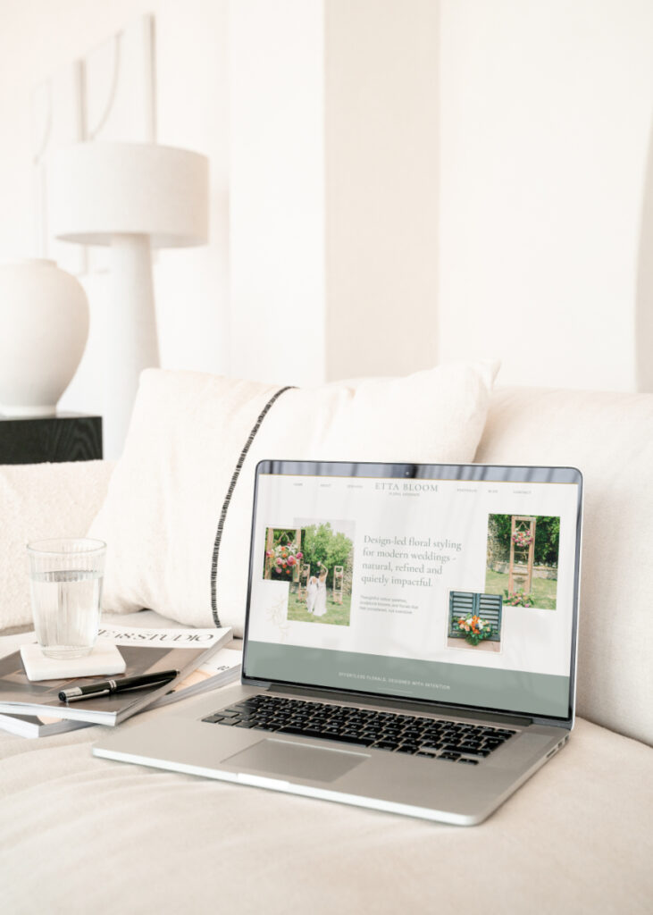
How to Customise a Showit Website Template in a Week (Beginner-Friendly Guide)
If you’ve just bought a Showit website template and you’re wondering how to use Showit without it taking over your life, you’re in the right place. One of the biggest reasons wedding business owners switch platforms is because Showit makes it genuinely possible to launch a beautiful, strategic website in days – not months.
If you’ve been weighing up Wix vs Showit, Squarespace vs Showit, or any other platform, the biggest difference is flexibility. Showit gives you complete design freedom without needing code, which is why it’s become the go-to platform for wedding creatives who want their website to look as good as their work.
In this post, I’m walking you through how to customise a Showit template in a week, step by step – even if you’re a complete beginner and figuring out how to use Showit.
Why Showit is ideal for wedding businesses
Before we dive into the day-by-day plan, it’s worth understanding why Showit works so well for wedding professionals. Unlike rigid builders, Showit allows you to design pretty much anything you want visually, without being held back by blocks or pre-made options, while still benefiting from SEO through WordPress and their SEO Settings.
This flexibility is why many wedding creatives who start on Wix or other website platforms, end up searching “Wix vs Showit” – and ultimately switching. Showit gives you control over layout, mobile design, and branding in a way that feels intuitive, even for beginners.
Day 1: Open your template + get familiar with Showit
Today is all about orientation. Open your template inside Showit (click Add to Library and enter your Share Key to load the template into your account). Then take time to click through each canvas and page. If you’re new, this is the best way to learn how to use Showit for beginners – by exploring rather than editing straight away. Duplicate one of the pages (by clicking on the three dots next to the page next on the left side column, and have a play around with a page to get used to where all the buttons are and how to swap photos and copy.
Within the interface you can see mobile view and desktop (and tablet) view, so it’s important that you edit these side by side, to make sure everything looks great on mobile too.
Focus on:
- Understanding canvases vs pages
- Seeing how desktop and mobile designs work independently
- Getting comfortable with the interface
This foundation makes the rest of the week feel much easier.
Day 1 & 2: Add your branding (fonts, colours, logo)
Now it’s time to make the site feel like yours. This is where Showit really shines. Swap in your brand fonts, apply your colour palette, and upload your logo. To do this, head to Design Settings at the top left of your interface and swap the 8 colours (from dark to light), and choose your Google fonts or upload your own. Then inside the Design settings you can set which fonts are used for Heading, Subheading, Titles and Paragraphs and the font size too.
Next you can add in your logo by going to the Media Gallery and uploading a PNG of your logo – ideally with a transparent background (you can do this in Canva). Then, head to the Site Header and Site Footer from your list of pages on the left side column, and double click on the logo that’s currently there. You can then choose the new logo from your media library which will pop up after you double click any image on the site.
You may need to do some slight edits through the template like swapping colours or fonts, as the ones that were on the original template may be darker or lighter colours and may not match right with the new colours or the font might be a slightly bigger or smaller font meaning it needs editing to fit your copy in the edited template. To swap colours simply click on the text box you’d like to swap and on the right side column go to Text Properties, choose a new colour and here you can edit font, font size, spacing and alignment too. If you edit one text box and you’d like to have the same formatting on another text box, click Ctrl + C on your keyboard on the text box you want to copy, then click on another text box and hit Ctrl + Shift + V, and this will copy the exact same text properties to the new box.
If you’ve chosen one of the best Showit templates for your niche, much of the structure is already done for you – you’re simply refining it to reflect your brand rather than starting from scratch.
Tip: Add in your copy, THEN edit the font size & colours so you know how much space you need for the copy first.
Day 3: Replace imagery + resize for impact
Replacing demo images with your own photography instantly transforms the site from a template, to your own. Showit makes it easy to resize, layer, and crop images visually – with no coding required and complete freedom to drag & drop photos anywhere on the canvas.
This is often the point where people realise why learning how to use Showit properly saves so much time compared to other platforms.
But, before you add all of your photos, you will need to resize them to make sure they aren’t too big for your site, as this can cause your website to be really slow to load. You can find bulk resizers online, but for most images on your website you won’t want the longest side to be more than 1500px. For images that fill the width of the website, you may need to use a slightly larger size so it isn’t blurry, but for most images on your website I would recommend resizing to a web size.
You can also name your images before uploading which can help with SEO. Think about what people would find you online for. As an example, a wedding photographer in New York might name their photo “Wedding at Cop Cot Central Park New York-01”, rather than “Jen and Peter 001”, as the first option tells Google what the photo is of, meaning anyone searching for a photographer for a Cop Cot wedding in New York is more likely to find your photo & website.
To add your images to your Showit account, click on Media Library within the template interface, and click Upload. You can separate them into Folders, which may be helpful if you put them into folders by weddings, or by style so you can find them more easily when inserting them into your website. Once you’ve uploaded, you can then double click on any photo within the template and swap. Then, if you’d like it to be bigger/smaller/longer/wider/narrower (you get the hint!), drag the corners by the small dots on each corner to the size you’d like.
You can also tilt by hovering your mouse over the corner until the curved arrow shows, the drag. There are settings within Showit to get your photos and any other elements like text boxes to sit in a specific place on the template. You can see these under Size & Position and use the Horizontal locking to lock elements to the right or left of the screen.
Day 4: Customise your homepage copy & design
Your homepage is usually the first place couples land, so clarity is key.
Focus on:
- What you do
- Who you do it for
- How to enquire
This stage is a big part of how to customise a Showit template strategically – not just visually. If you’ve chosen a Showit website template designed with strategy in mind, there should be canvases designed to guide couples to enquire already built in.
Ensure you choose photos that really showcase your signature style or your main service, and make sure you customise the mobile version too, as this is where most clients are going to be looking.
Day 5: Edit remaining pages (About, Services, Contact)
Once you’re happy with your homepage, work through one page at a time rather than jumping around. Most Showit templates are designed with flow in mind, so trust the structure and refine the content.
This approach is especially helpful if you’re still learning how to use Showit, as it prevents overwhelm.
Swap out photos, copy, font & colours (using your homepage as the main inspiration), and work through each your pages, starting with the most important first (you can always add more later!). At minimum, you should have a services page, contact page, and an about page so you can launch your website.
Remember, this is about launching a website so you can start booking clients, not making it perfect and spending a year on it while you tell everyone “my website is coming soon”, knowing well enough that you could have launched it months ago.
Day 6: Mobile optimisation + final tweaks
Showit allows you to design mobile layouts separately, which is a huge advantage. Spend time adjusting spacing, font sizes, and button placement so everything feels intentional on smaller screens. Make sure there isn’t overlapping text, and ensure it flows just as well on mobile.
This is one of the key reasons many wedding businesses choose Showit after comparing Wix vs Showit.
Day 7: Final checks + launch
On your final day, check links, forms, and SEO basics before publishing. Once live, you’ll have a fully customised site built on one of the best website platforms for wedding businesses – without weeks of back and forth, or tech overwhelm.
_____
Customising a website doesn’t need to be overwhelming. Once you understand how to use Showit, and you start with the right foundation, launching becomes a focused, achievable process.
If you’re short on time or want expert eyes on your site, I also offer template customisation and Showit VIP Design Days – where I handle the edits for you and get everything polished and ready to share.

