

What Should a Wedding Venue Website Include? (Your Checklist)
Wedding venues come in all shapes and sizes, from the big ones with a hotel attached to the smaller family run ones that feel more like someone’s home than a business. What they each need from a website is completely different, right down to whether a template or a fully custom build makes more sense, but I keep seeing the same two mistakes wherever they sit on that scale.
The two mistakes almost every wedding venue website makes
The first is overwhelm. Couples land on the page and there are pricing tiers, add on packages, terms and conditions and about four different contact forms all fighting for their attention like it’s the last biscuit in the tin. They can’t tell what to look at first or what to do next, so plenty of them just leave rather than work it out.
Then there’s the complete opposite, and I’d say it’s the worse of the two. That’s the venue that hides everything useful behind a brochure download or an email address you have to hand over first. I get why it happens, it feels like it protects the phone call or at least gets someone onto a list, but in reality it puts couples right off. Nobody wants to give away their email just to find out you’re miles outside their budget, so they go and look at the next venue on their list (the one that told them the price up front).
Between those two is a smaller problem that creeps in just as often. The photos and the words don’t show couples what it would feel like to be in your space, or even which bits of it they get to use on their day.
Between those two is a smaller problem that creeps in just as often. The photos and the words don’t show couples what it would feel like to be in your space, or even which bits of it they get to use on their day, and that’s usually the first thing I look at when I start a wedding venue website design project.
What your venue website is actually for
With most wedding suppliers, the job of the website is to get someone to book. With a venue the goal shifts slightly, because the job of your website is to get the right couple to book a viewing.
Give a couple just enough to know whether you fit their guest list and their budget before they give up an entire Saturday driving out to see you.
I think a lot of the bigger chain venues get this the wrong way round. They want couples to come in and be sold to, face-to-face, by an events coordinator, so the website holds information back on purpose to force that conversation. That just isn’t how couples shop anymore. People are busy, plenty of them are getting married somewhere they don’t even live and they usually have two or three venues on a shortlist already. They want to rule venues in or out before they spend a weekend on visits, so if you make them chase you for the basics, they won’t bother. They’ll cross you off and go with whoever told them what they needed to know.
What your wedding venue website should include
Here’s your checklist for what a wedding venue website needs to earn that viewing, and if you’re worried a template can’t reflect a space as unique as yours, it absolutely can.
Imagery that shows the day in full swing
An empty marquee or a perfectly tidy dining room tells a couple almost nothing about how their day will feel. Show the space with people in it, like first dances, guests mid laugh with a drink in hand, the florals up and the fairy lights on. If part of your venue isn’t there all year, like a tipi, an outdoor setting or a seasonal marquee, this matters even more, because those photos might be the only chance a couple gets to picture it full of people instead of an empty structure.
A starting price
You don’t have to publish every package line by line if that’s not your style. Even a “from” figure or a rough range lets a couple work out in seconds whether you’re in their budget, instead of emailing you and waiting three days to find out you were miles off.
Guest capacity for every space
Say it plainly and don’t bury it in a PDF. If a couple is planning for 120 guests, they should be able to see whether your barn fits them in seconds, not click through four pages hunting for that make or break number.
The practical stuff couples always ask anyway
Think catering (in house, preferred suppliers or bring your own), accessibility, parking, on site accommodation, curfews and whether they’ll need to hire their own marquee or tipi on top of what you offer. These questions come up in nearly every enquiry, so if you answer them on the website you’ll get fewer basic questions clogging up your inbox and more serious enquiries landing in it.
A next step that’s an actual viewing
Something like “book a viewing” or “check our dates” beats a vague “contact us for more information” every time. Be really clear about what happens next and make it easy to book straight from the page, so couples aren’t sending a form off into the void and hoping.
A video walkthrough if you can
Photos show a single moment but video shows a feeling. Couples can feel like they’re actually inside the space and get a proper sense of scale that a still photo can’t give them. It doesn’t need to be a big production, it just needs to be current and honest about what’s really there.
Not sure which template could even work for a venue in the first place? Here’s how I’d choose one.
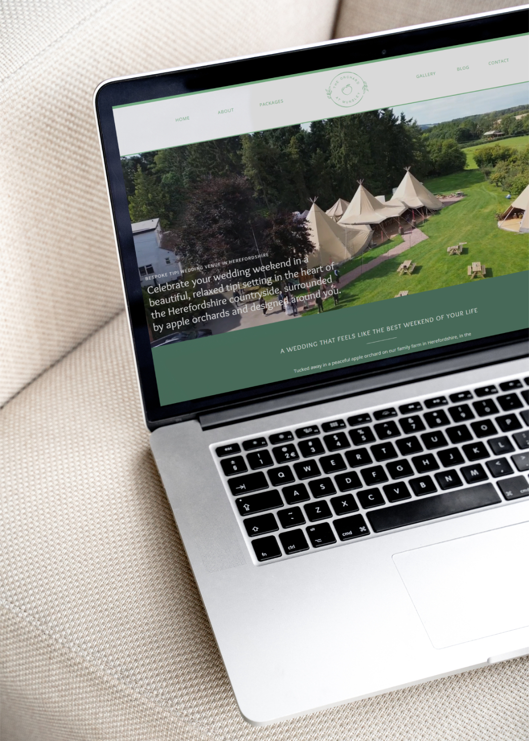
A real example, The Orchard at Munsley
The Orchard at Munsley is a great example of all this in action. Before we worked together their website already had some lovely touches, including a video and plenty of information, but the photos were small and weren’t doing the tipis justice. And because the tipis aren’t up all year, that gallery is sometimes the only chance a couple gets to picture a wedding there.
So when I rebuilt everything on my Laurel Showit template, the whole focus became the imagery. Bigger, bolder photos, real couples and real guests caught mid celebration instead of staged and empty, and the tipis looking their absolute best. Now a couple scrolling through in the middle of February can properly feel what a summer wedding there would be like, months before the tipis have even gone up.
The happy medium is the whole point
If I could get more wedding venues to take one thing away from all this, it’s that giving couples everything and giving them nothing are both the wrong instinct. You’re aiming for a happy medium, with enough information that couples feel informed and excited, but not so much that they feel like they’ve learned it all and don’t need to visit.
Show them what the experience feels like, give them a rough idea of the cost, answer the practical stuff before they have to ask, and then let the viewing do what it does best, which is turning “this looks like an option” into “this is the one”.
If your own wedding venue website is stuck in overwhelm or brochure wall territory, that’s exactly what I build into every Showit template for wedding venues. Have a browse and see which one fits the way you want couples to experience your space.
Not ready for a full rebuild just yet? A Wedding Business Website Audit is a lower-commitment way to find out exactly what’s working on your current site and what isn’t, before you decide what to do next.
Want me to build yours? Book a discovery call and we’ll talk through the all-important details over a cuppa!
September 21, 2026
Leave a Reply Cancel reply
Showit website templates, Showit template customisation, Showit VIP Design Days, resources and website design for wedding businesses
Website © 2024-2026 | Calluna & Thyme
