Can I Customise a Showit Template to Fit My Brand?
If you’ve been eyeing up a Showit website template and wondering whether it’ll end up looking like every other wedding business on the internet, I get it. It’s one of the most common things I hear but it’s the question I love answering most, because the answer is a very enthusiastic yes.
Let me explain exactly what’s possible, what to watch out for, and why a Showit template might just be the smartest website decision you make this year.
Showit templates are more flexible than you think
Here’s what makes Showit different from every other website platform: it’s built like a design tool, not a page builder. Which means when you buy a Showit template, you’re not locked into a rigid structure where you can just swap a colour here and a font there and call it done.
You can drag and drop entire sections. Move canvases around. Swap layers. Add new pages. Remove ones you don’t need. Redesign whole sections based on your brand. The creative freedom is genuinely, literally endless and I don’t say that lightly.
At its simplest, customising a Showit website template can be as easy as swapping out your brand colours, uploading your fonts and dropping in your images. Double-click, swap, done. At its most involved, you can strip it back and rebuild it around your brand from the ground up. Both are valid. Both will get you somewhere brilliant.
The mistake most people make before they even start
If there’s one thing I see time and time again, it’s wedding business owners opening up Showit, staring at the template, and just…diving in. No plan. No assets. No idea where anything is. Then wondering why it feels overwhelming.
This is why every Showit template from Calluna & Thyme comes with tutorial videos, because starting with a clear plan makes all the difference.
Before you touch a single canvas, here’s what I’d recommend getting sorted:
Prep your assets first.
Resize your photos. Pull together your logo files, your brand fonts, your colour codes, your brand strategy and your positioning. Have everything in one place before you even open Showit.
Give yourself a loose plan.
Know roughly what pages you need, what you want to say, and what you’re working towards. If it deviates as you go? Totally fine. But starting with a plan means you’re not making decisions on the fly when you’re already three tabs deep.
Duplicate a page and just play.
This is my favourite tip. Before you touch anything on your actual template, duplicate one page and use it as a sandbox. Move things around. Drag sections. Swap out an image. Get familiar with where everything lives. Then delete the whole thing and start fresh with confidence. It sounds simple, but it removes so much of the fear around messing things up.
One more thing…think about your colour choices carefully. It’s easy to get excited and start plugging in your brand palette without thinking about contrast and readability. Make sure your text is still clear and visible, especially for accessibility. A beautiful palette that nobody can actually read isn’t doing you any favours.
If you want the full breakdown of exactly how to tackle this, I’ve written a step-by-step guide to customising your Showit template in a week that walks through the whole process.
What a real Showit template customisation looks like
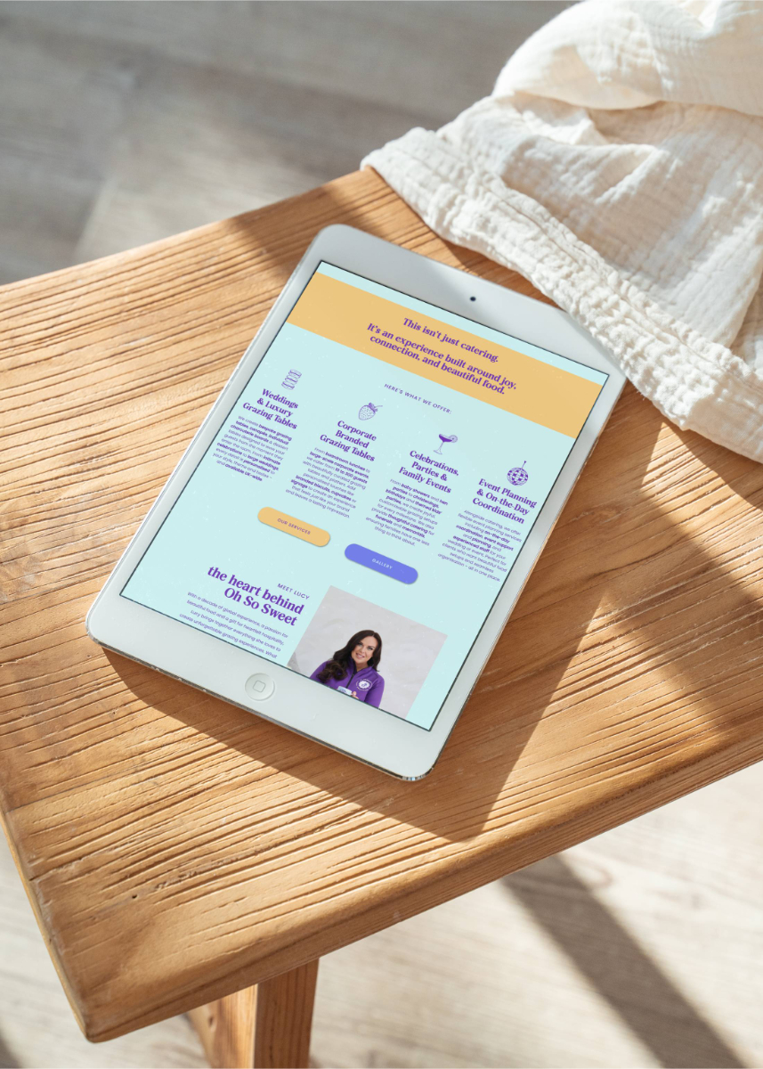
Let me tell you about Lucy.
Lucy runs Oh So Sweet, a grazing table and events business, and she came to me with the most incredible branding. We’re talking icy blues and purples, bold pops of pink, orange and yellow, and the most fun set of brand icons – macarons, champagne glasses, strawberries, disco balls. Absolutely her.
We started with Poppy, one of my Showit templates designed for visual businesses that still need space to tell their story. It has these gorgeous wavy lines and wiggle details that make it feel playful and different.
Lucy’s old website was full of loads of photos, no text, just an email address and a phone number. It wasn’t doing her or her grazing tables justice at all.
By the time we finished, Poppy was unrecognisable. Her wavy brand frames replaced mine. Her icons were woven throughout. Her bold, joyful colour palette was everywhere and her copy finally reflected how brilliant she is at what she does.
Nobody looking at that website would see a template. They’d see Lucy.

“But what if someone else buys the same template?”
This is the fear, isn’t it? You find a template you love, then picture another florist in your county buying the exact same one and your websites looking like twins.
Here’s the truth: once you add your own images, your own branding and your own copy, it looks completely different. Couples – the people whose opinion actually matters – won’t have a clue it started from the same template as anyone else. They’re not browsing Showit marketplaces comparing design structures. They’re landing on your website and feeling something. And what they feel will be entirely shaped by your brand, your photos and your words.
Could a competitor buy the same template? Sure. That’s a risk that comes with any template purchase. But with your own spin on it? They’d struggle to prove it and couples would struggle to work it out.
Find your perfect Showit template
Not sure which template is right for you? Here’s a quick run-through of the Calluna & Thyme template collection, or if you want the full guide to choosing the right template for your business, I’ve written exactly that.
Sage – Minimal but bold and designed for wedding creatives who want to stand out for being a bit different. Think photographers, content creators, DJs and bands. If your brand has an edge to it, Sage is your template.
Laurel – Classic, timeless and beautifully visual. Laurel is perfect for wedding planners, bridal hair and makeup artists and venues who want a website that feels polished, elegant and easy to customise for them.
Poppy – Fun, playful and full of personality. Poppy is designed for visual businesses that are bold and creative but still need real space for their story and services. As Lucy proved, it can go anywhere your brand takes it.
Evelyn – Designed in collaboration with Claire-Jane, a bridal hair and makeup artist with 15 years of industry experience and leading her own team of 20. Evelyn is premium, minimal and built specifically with bridal hair and makeup artists in mind, complete with a bridal experience page and bridal journey section, taking couples from their trial right through to the wedding day. It could work for other wedding businesses too, but it was made with MUAs at its heart.
You don’t need a custom website to get a great result
This might be the thing I want you to take away most from this post.
A Showit template, done well, can give you a semi-custom website that looks and feels completely tailored to your brand, without the custom website price tag, and without waiting months for a designer’s availability. (And if you’re wondering whether Showit is good for SEO — yes, it absolutely can be, when it’s set up right.)
With the right prep, the right guidance and a bit of time set aside to get familiar with the platform, you could have a brand new website live within a week. Or a few weeks, if life is busy (which, as a wedding pro, it always is).
It doesn’t have to be difficult. It doesn’t have to be overwhelming. And it absolutely doesn’t have to look like anyone else’s.
If you’re weighing up whether to customise a template yourself, have someone do it for you, or go fully custom, I’ve written a whole post on exactly that – Showit Template Customisation vs Custom Web Design which is worth a read before you decide.
Ready to find your template?
If you’re a wedding business owner who’s been sitting on the idea of a new website, a Showit template might be exactly what you need to get there, without the overwhelm, without the wait, and without a budget that makes your eyes water.
Browse the Calluna & Thyme Showit website templates and if you’d rather hand the whole thing over to someone who actually gets the wedding industry, you know where I am.
Want to try Showit before you commit? Use my Showit affiliate discount code CALLUNATHYME for a free trial plus one month free. You’re welcome!